

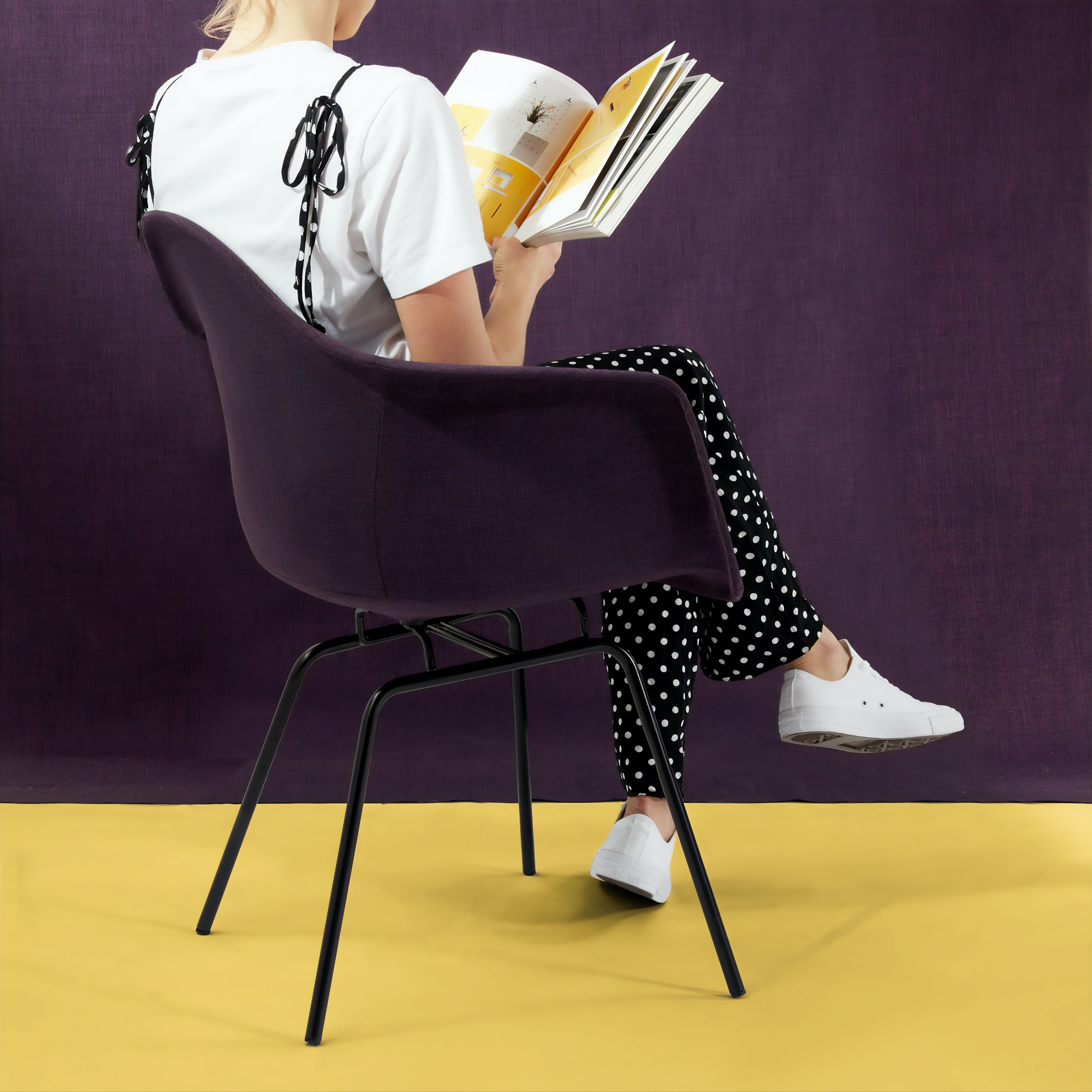
Mable App: Shop Furniture in Augmented Reality
Year: 2020
Framework: DesignLab’s UX Academy project
Role: Researcher, UX/UI Designer
Duration: 4 weeks
Tools: Figma, Marvel, Adobe Photoshop + Illustrator
Mable is a new app for interior design.
Having partnered with top furniture stores in the U.S., Mable is currently scanning and updating all catalog items in its inventory list. Having accumulated over 1500+ furniture and decor pieces, it’s now time to start designing the app!
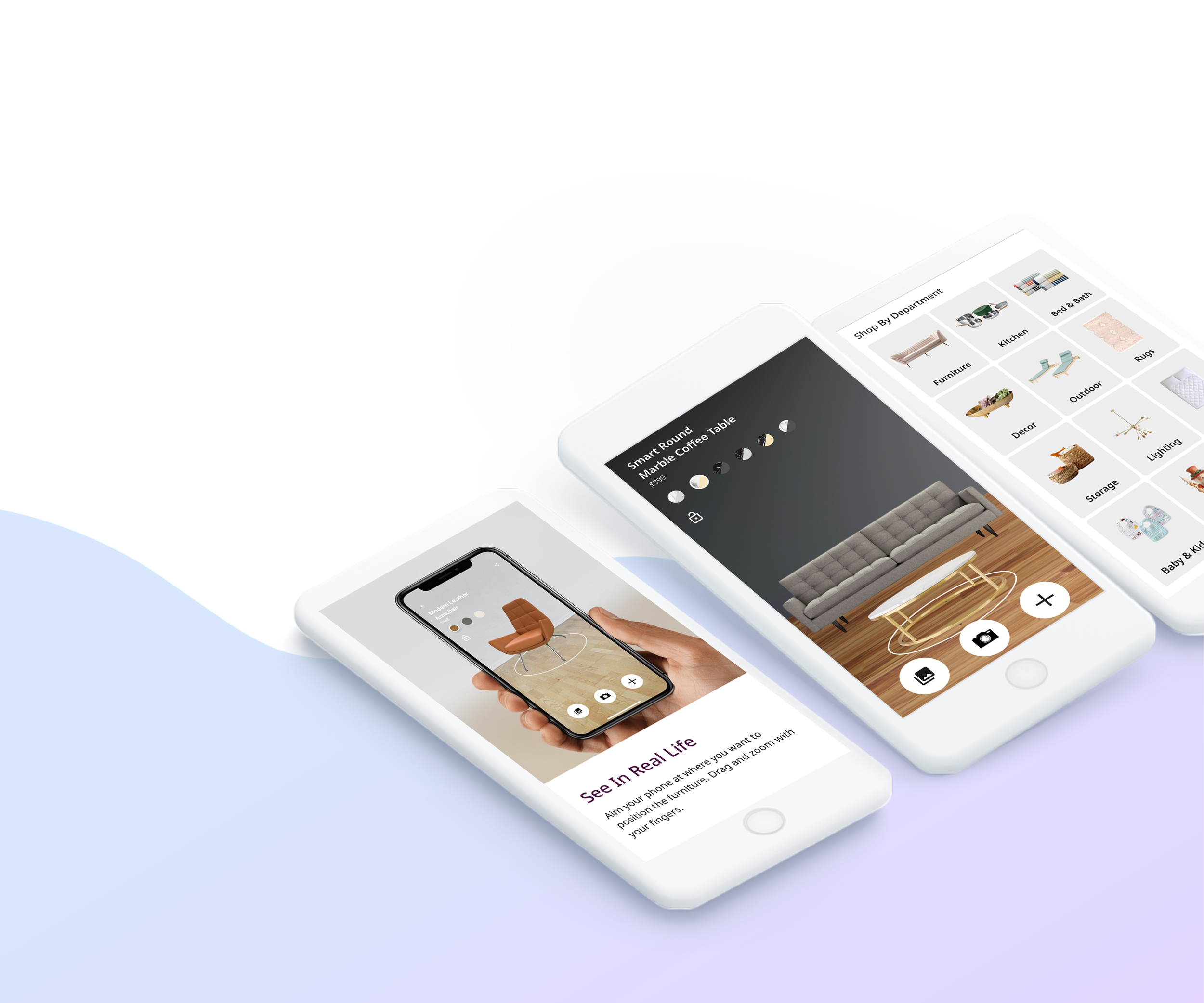
Besides being able to browse through the catalog and order anything online through the app, users can also use augmented reality (AR) on their smartphones or tablets to place their desired furniture in their home.
Project Goals
App Walkthrough
Design an onboarding page to show Mable’s partnerships, benefits of the app, and how it works.
View Furniture in AR
Design an iOS app for shoppers to browse furniture and decor pieces and use AR to place them in their homes.
Purchase Flow
Design the in-app checkout process.
The Process
01
Empathize
Conduct research to understand users’ needs, motivations, and frustrations.
02
Define
Synthesize research findings to fully understand users and the problem space.
03
Ideate
Brainstorm potential solutions, staying focused on users’ needs and desires.
04
Prototype & Test
Build out ideas with a functioning prototype, and conduct tests to refine solution.

“To understand the people I’m designing for and the problem I’m trying to solve. I started the Empathize phase by creating a Research Plan that outlined my research goals, assumptions, and methodologies.”
Research Plan
Before conducting research, I created a plan to house my overarching research goals, assumptions, methodologies, and timeline. This helped me stay focused and on track throughout the research process. The primary research goals of this project were:
Identify needs, wants, expectations, and goals that people have with browsing and purchasing furniture online
Understand people’s experience with buying furniture online and what motivate their decisions (eg. categories, brands, app features, etc.)
Identify pain points and frustrations that people have with browsing and purchasing furniture online with and without AR
Identify current trends, market gaps, and opportunities to create value for customers
Research Assumptions
In order to build clarity for what problems to solve and what designs to create, I needed a place to begin exploring the story. So I prefaced my research with assumptions about furniture shopping and AR. These assumptions were not set in stone as I would challenge and clarify them throughout my research. My research assumptions were:
People always know what they want when they purchase furniture
People like seeing multiple furniture items in AR view
People are more likely to purchase furniture if they can see it in their space
People are drawn to good images so they’ll know exactly what to expect
People shop by brand and room as much as they do by department

Research Methods
01
Market Research
Provides insights to the online furniture purchasing space but also prospective ideas, trends, features, and functionality that new entrants and existing players are ideating or pursuing, especially competitors that are currently using AR to service their customers.
2 hrs
02
Competitor Analysis
Uncovers what product offerings and services customers love; what pain points and frustrations have not been addressed; market gaps where Mable can identify opportunities to stand out; and marketing/sales tactics competitors are using to attract and retain customers.
1 hr
03
User Interviews
Allows me to empathize with people that have shopped for furniture in person or online before. What is the experience of a real world customer? What are his or her needs, wants, goals, and aspirations with furniture shopping? What pain points and frustrations can I empathize with?
7 hrs
04
Survey
Open and closed questions on a survey provides context and motivation behind user behavior, as well as qualitative insights on how users think about a problem. This is the guiding light behind what features and functionality would impact business value and design direction.
3 hrs
Market Research
To kick off my research, I looked into the furniture market to learn about ongoing patterns, trends, market players, and customer habits. A few notable things I discovered were:
84% of Americans buy their furniture new, and 74% buy in person rather than online
Common sources of design inspiration come from in-store displays (38%), social media (30%), TV shows (15%), and friends and family (12%)
56% of shoppers avoid boutique furniture retailer if shipping costs are high; 36% avoid boutique furniture retailer if delivery is slow
Furniture is the top product people want to shop with AR (60%), more than clothing, groceries, and shoes
Benefits of AR in the furniture business are: 1.) Higher online sales, 2.) Greater buyer’s comfort and ease, 3.) New sales channel - tech integration outrun competition, and 4.) Personalized advertising
Competitor Analysis
I identified direct and indirect competitors in the furniture market and looked at their relative strengths and weaknesses. In what ways do they bring value to their customers? What gaps are there in the furniture market where customers’ wants and needs are not addressed? I learned that many renowned e-commerce websites like Target and Wayfair categorize furniture in different ways (by room, style, or type), as well as offer Pinterest-like design inspiration and interactive AR view to test product layouts. However, interestingly enough there were limitations to the AR function — users could only see one product at a time, and in order to change color or finish, users must return to the product page.
Despite learning through market research that AR was such a sought after ordeal in the furniture market, I was surprised that there were so many limitations. Which made me wonder if 74% of shoppers still preferred buying furniture in person rather than online because their wants and needs were not met by the existing AR function.
User Interviews
I went in-depth with potential users to gather qualitative data on their motivation, expectation, and behavior.
Duration: 15-20 minutes.
Participants: Have purchased furniture in store or online in the last year.
Goal: To learn about participants’ furniture shopping experience. What are their needs, goals, and motivations? What are their perceived benefits of shopping online versus in person? What pain points or frustrations have they encountered?
Insights: I recognized a few patterns from my interview transcripts. For instance, I learned that 75% of my participants preferred buying furniture in store because they could physically see and touch the furniture. However, it was interesting that almost half of them found AR helpful in viewing a couch or table in their home before going into the store, which coincided my assumption that people were more likely to purchase furniture if they could see it in their space. Many voiced concerns about their online furniture shopping experience — lack of quality photos or descriptions, overwhelming website layout with no clear navigation, and nested fees.
Survey
I conducted a 10 question survey to understand people’s preferences, opinions, and attitudes towards furniture shopping. I came across an interesting insight that even though half of the participants preferred buying furniture in store, 2/3 of them considered AR somewhat important in affecting their buying decision. This meant that people were still drawn to AR despite limitations identified in my Competitor Analysis. Below was a summary of my overall findings:
DECIDING FACTORS:
Price and quality were the top important factors peopled considered when buying furniture.
PLACES TO BUY:
Out of the 24 participants, 50% preferred buying furniture in store and 25% preferred buying from big e-commerce websites like Amazon.
AR IMPORTANCE:
71% considered AR somewhat important in affecting their buying decisions.
FRUSTRATIONS:
More than half of the participants said lack of quality photos, poor variety, and high shipping costs were difficulties encountered while shopping online.
Empathy Map
Based on the insights I gathered from my primary research, I created an empathy map to organize my research and learn about users’ behaviors and attitudes. In both my user interviews and survey, I discovered that price and quality were main factors people considered when buying furniture, and lack of quality photos and nested fees were major annoyances they’ve come across online. Below I summarized user frustrations and needs in the form of pains and gains.
GAINS:
See photos in different room settings
Expansive filters
Able to swap out colors and finishes in AR
Estimated shipping and delivery dates
Detailed product information
PAINS:
See only one furniture at a time
Not enough quality photos or variety
No indication if item is low on stock
Lack of option to browse by categories
High shipping and cancellation fees
User Persona
After using an empathy map to consolidate my research findings, I created a user persona, Angie, to further explore people’s goals and frustrations with furniture shopping. Here I’ve validated two of my assumptions — people are more likely to purchase furniture if they can see it in their space, and they are drawn to good images to help them decide on a potential purchase. I wanted to create a good user experience for my target user group, but I had to identify the correct problem space where there was a need but current market players have not addressed or failed to meet. With the user persona I identified Angie’s 4 main goals and pain points to help me think about the problem I’m trying to solve for my users.
GOALS:
See product pictures from different angles and in different room settings.
Be able to filter and sort by various categories, type, and style.
Read detailed descriptions that clarify industry-specific words.
Be offered product recommendations and ideas on how to style a room.
PAIN POINTS:
Poor quality photos, low product variety, and inadequate description
No indication if an item is sold out or low in stock
High shipping fees, cancellation fees, and service fees
Unable to browse by category, type, or style
Customer Journey Map
I walked through the potential touch points of Angie’s customer journey based on what I learned about the furniture shopping experience. I resonated with her thoughts and feelings and looked for opportunities where Mable would succeed in meeting her needs. Many of these opportunities like quality photos and detailed descriptions were derived from my secondary research. However, I noticed that based on my understanding about users’ goals and motivations, there were many opportunities to increase customer value that most direct competitors have not addressed even though the need was obviously there. These opportunities, such as design inspiration with product tags and the ability to change color in AR view, would be a solid starting point for me to brainstorm solutions in the Ideate phase.
Below was an example of a touchpoint to opportunity conversion:
TOUCHPOINT: Angie is excited to see how the store styles its furniture pieces
THOUGHTS: “The Room Ideas section is inspiring; it shows all furniture names!”
OPPORTUNITIES: Provide decor inspirations in various room settings, and be sure to tag furniture with product links

“In Define phase, I turned the knowledge and insights gathered from my research into tangible and actionable ideas that would solve problems identified up to this point.”
Problem Statement & HMW Statement
After learning about who my users were and their wants, needs, and pain points, I had to define the problem I would try to solve for them. This was where I turned empathy into an actionable problem statement with clear-cut objectives to work towards. I used the method drawn from user research: “(Persona) needs a way to (user’s need) because (insight).” Based on insights and problem areas found during your research, I also created a How Might We Statement to brainstorm new ideas and opportunities.
Problem Statement: “Angie needs a way to purchase furniture online because due to Covid-19 lockdowns she hasn’t been able to go into a store. Our solution should deliver a way for Angie to easily and effectively use AR to purchase furniture online knowing that they are the right fit for her space.”
HMW Statement: “How might we design the furniture shopping experience for Angie so that she can easily find and purchase the appropriate furniture for her space.”
Project Goals
Before ideating solutions based on the problem statement and HMW statement defined above, I needed a holistic view of the project goals to help me think strategically about the primary objectives. I learned that overlapping goals such as easy to use and secure checkout addressed my problem statement as they ensured the ease and effectiveness of purchasing furniture online.
I came to the understanding that meeting these goals would be the driving force behind creating a positive user experience. In addition, I defined technical constraints and limits that I must work within to achieve my goals.
Product Roadmap
After setting the vision, goals, and initiatives for the product and how they would support overall business objectives, I brainstormed ideas on what features and functionality to design for. I referred back to details of who the users were and what they needed, and in doing so, discovered many features that contribute to a positive user experience (an overlapping user and business goal). For instance, a product page with AR feature alongside pictures of furniture in various settings would achieve two of Angie’s goals — provide ideas on how to style a room as well as what the product looks like in different rooms.
All features tie to a project goal; however, those that support essential business function such as product description and checkout process had the highest priority, while others would be nice to have or could come later as features are updated and developed.
Sitemap
With a list of project goals and features established, I created a sitemap to help me visualize the structure of the website and the relationship between content on the proposed pages. Through this sitemap I could see how the navigation should be structured, where content would sit, and what I needed to design. In my user persona, two of Angie’s frustrations with furniture shopping were lack of product variety and not being able to browse by category, type, or style. Therefore in the Shop section of my sitemap, I categorized furniture by department, style, room, and brand. I noticed sales and new arrivals were industry standard categories, so I integrated them into this section as well. Before my research I assumed people shop by brand and room as much as they do by department. Given this contradicted my research findings, I made a mental note to check the validity of this assumption during usability testing.
Task Flow
After mapping out the overall information architecture, I created a task flow to illustrate the primary steps Angie would take to accomplish a goal. How would she go about browsing products, finding design inspiration, and making a purchase? In order for her to achieve these goals, what features and pages needed to be in place? While asking these questions and creating the task flow, I came across an interesting observation — each task subsequently followed the one before it. The linear nature of these tasks emulated a realistic shopping experience that I could use to test the app’s navigation and interface with (hint: usability testing).

“Based on what I understood about users and the problem space, I began to “think outside the box” during the Ideate phase to identify and create new solutions.”
Medium Fidelity Wireframes
After defining project goals, features, site hierarchy, and tasks, I moved onto designing the screen blueprints. I started off with low fidelity wireframes, but quickly realized I needed real context to define visual hierarchy and content flow. So I created medium fidelity wireframes with a little more thought into the specifics like layout, verbiage, and components. I referred to Apple’s Human Interface Guidelines for AR best practices, and researched current market players’ app design and functionality, asking myself if they solve the problems I’m trying to solve for my users. And if yes, what were some limitations? For instance, Wayfair and Houzz use AR in their apps, but based on my research findings, users were frustrated with seeing only one product at a time and not being able to change color in AR mode. I needed to make sure not only do I address users’ needs with my design, but also mitigate their frustrations. A few ways my medium fidelity wireframes do so were:
Find design inspiration and room ideas where products are tagged for quick lookup
Able to browse by various categories but also narrow down searches with refined results
Gather in-depth information about a product, including dimension, weight, assembly instruction, and product specific measures like seat depth and firmness
View multiple furniture pieces in AR mode, and change color without leaving the AR experience (per Augmented Reality - Human Interface Guidelines)
Create a streamlined purchase experience with various checkout options
Below were a few of my medium fidelity wireframes — Room Ideas page, Results page, Product Page, Cart page, AR page, and Refine page.
Logo
Given Mable was a new app, I had to define brand attributes that the audience would see as an inherent part of the brand. Deep diving into the core purpose of the brand and the industry it was in, I found the words modern, reliable, simple, dynamic, and natural to best represent Mable.
In addition, I needed a logo that attract all types of people and styles. While doing my market research, I found it interesting that the industry standard amongst furniture stores was minimal design with brand color injections. Keeping that and Mable’s brand attributes in mind, I brainstormed various logo styles. For my final design, I customized an “M” symbol and placed it in a purple hexagon. This best represented the brand because it signified the word “Mable”, contained brand colors, was modern yet simple, and alluded to a furniture item. It was important that Mable’s logo was not only unique, but also recognizable, memorable, scalable, readable, and clear.
Brand Style Tile
Once I have established Mable’s brand attributes and logo, I went onto Pinterest to collect visual assets that embodied the brand. Because Mable was simple yet dynamic, I kept the color palette monochromatic with a pop of purple (a color that represents innovation), and I used a sans-serif type that was modern yet reliable. I created a brand style tile to collectively house all the visual elements defined such as color, type, icons and buttons. From this detailed “mood board” I gained a unified sense of the brand aesthetics as well as context notes to achieve consistency across different mediums.
UI Kit
Moving on from the brand style tile, I created a UI Kit to house all design components of the user interface. To ensure the UI elements were flexible and modular, I created symbols and text styles in Figma that made my designs easier to change. Mable’s color palette was monochromatic with a muted purple as its brand color, which during this process I learned was a good choice because 80% of the app was colorful pictures of products and rooms. A brighter brand color would have been too overpowering.
Something I learned about affordance once a user adds an item to cart was the bottom sheet. My initial design prompted a change in the cart icon, but did not elicit actionable information or addressed where one might go from there. When my DesignLab mentor suggested bottom sheet, one that presents a sub-task while keeping the main context visible so as to aid users’ mental flow, I knew it was the “missing link”. By adding a bottom sheet, people were aware of their available options, which in this context was either move forward with a purchase or go back to browsing.
In the future as Mable adds more functionality and products to the app, having an UI Kit would ensure all design elements remain in the same style and work as one mechanism.
High Fidelity Wireframes
After defining the information architecture and UI components, I filled in the wireframes with color, photos, and branding to visually represent the end product. I would use these high fidelity wireframes to build a prototype that would test everything from whether the design concept works as intended to whether people are able use the app. As mentioned earlier in my UI Kit, I learned to use bottom sheet to convey actionable information. I went back to my wireframes and created bottom sheets where there were either self-contained tasks or a set of closely related options. For instance, when users clicked on a product tag under Shop the Look, a bottom sheet would provide various options to proceed — navigate to the product page or view similar items.

“Produce an early, scaled down version of the product to test on real users. Below I created a prototype with realistic interactivity and content that emulated the final design.”
Interactive Prototype
With my wireframes complete, I created a higher fidelity prototype for users to shop and purchase furniture. Throughout research, there were various findings that I learned supported or negated my assumptions. For instance, I learned through my user interviews that Angie would like to be offered product recommendations and ideas on how to style a room, which contradicted my assumption that people always know what they want when they shop for furniture. Even though my assumption failed, I still gained insights about my users from my research. Along with those tried and true assumptions, my discoveries about users’ needs, goals, motivations, and frustrations were the driving force behind my design ideas.
With this prototype, I learned to find problems early in the design process. I noticed not all pages offered affordance in going back to the previous page or exiting a modal, so I made sure those issues were resolved before I conduct usability testing.
From this prototype, users were able to do the following:
Search design inspirations and room ideas
Browse products and view them collectively in AR
Swap colors and finishes in AR mode
Purchase items saved in lists
Prototype Walkthrough Video:
Usability Testing
During the task flow process I built linear tasks that emulated a realistic shopping experience. I would use those tasks to test the usability of the prototype and validate my assumptions to ensure I have created the right solution to the right problem.
PARTICIPANTS:
Duration: 20 minutes.
Participants: 5 users, both male and female, between the ages of 24-40.
Methodology: in person think-aloud evaluation method, and remote Zoom video call with recording.
Eligibility: Has shopped for furniture in the last year and is familiar with using AR.
GOALS:
Observe and understand how users navigate Mable’s app to shop furniture.
Determine whether the app design is intuitive and align with participants’ mental models.
Validate my assumptions and determine whether my design truly meets users’ needs.
Identify features or functionality that are confusing or misleading.
Identify areas of improvement on the overall user experience.
TASKS:
Browse sofas and loveseats to find a mid-century sofa that you like. Learn about it and view in AR.
Browse Design Ideas and come across a marble coffee table. View in AR the table AND sofa from yesterday. Play around with the table’s different color options in AR, ultimately settling on marble and chrome. Take a picture and save the items in a new list.
Find the list you created and purchase all the items in it.
Test Findings
The usability testing gave me valuable insights into participants’ thought process in navigating Mable’s app. Some insights supported my research assumptions; others did not. For instance, 100% of participants were able to complete the checkout process, with more than half voicing how easy the navigation was. Most of my participants were satisfied with the ability to change color and add multiple items in AR view. Even though I was able to quantifiably validate my assumptions, my design was not flawless. Based on the feedback I received, the lock function was not intuitive and there was no indication of its purpose nor visual feedback once pressed. I took these major patterns, pain points, and frustrations into consideration and made recommendations on how the usability and interface can be improved to better meet users’ needs.
PATTERNS:
80% of participants were satisfied that they could add recently viewed items to AR view.
60% of participants found “How It Sits” under Product Details and the ability to change color in AR view helpful.
60% of participants said the interface was clean; 40% said the website was easy to navigate.
PAIN POINTS & FRUSTRATIONS:
40% of participants didn’t know what was the lock function in AR view.
40% of participants were not able to find the list they created.
RECOMMENDATIONS:
Rename “Favs” to Lists” in the bottom navigation bar.
Add “Position locked” pop-up message when users press lock in AR view.
Final High Fidelity Wireframes
The usability testing gave me helpful insights on the strengths and weaknesses of my prototype as well as the validity of my assumptions. I learned that affordance was missing in AR view, so I added visual feedback to the lock function. I tested my assumptions to discover that some were incorrect. For instance, even though there were other options to shop such as by room or style, most users preferred department. Based on what I learned about participants’ pain points and frustrations, I made changes to my prototype so that it aligned with users’ mental models and was more effective in meeting their needs.
Below were the revised high fidelity wireframes for the Homepage, Shop page, Products page, Sofa page, AR page, Cart page, Checkout page, and Design Ideas page.


Research Users’ Experience
When I first brainstormed research questions in the Empathize phase, I had a lot of questions along the lines of “what features have made furniture shopping a pleasant experience for you”. However, I soon realized that these questions were geared towards the solution and not the problem. In actuality, I should be drilling into what the problem was and why I should be solving it, not how. So I started formulating questions that asked users to share their furniture shopping experience with me. “What made it a good experience? What difficulties and pain points did you encounter?” By asking experience-based questions, I could better define users’ needs and the problems to solve for them. Both provided a point of reference to judge potential solutions against. Through researching users’ experience, I was able to ask the very important question — “Does this solution solve the problem?” If the answer was no, then it was likely the wrong solution.
Affordance is Everything
During usability testing I found out the lock function was not intuitive as there was no indication of its purpose nor visual feedback when pressed. Moving forward, I would ensure my designs have high affordance so that there is no doubt in users’ minds what will happen when they click a button, enter data, or otherwise interact with the system.
Contextual Inquiry
This project commenced during the global pandemic, but if social distancing was not an issue, I would conduct contextual inquiries to observe users shopping for furniture on their phone. The open-ended nature of a contextual inquiry uncovers tacit knowledge and provides additional insights into customer behavior — what are they seeing, doing, thinking, and aspiring.
State and Test Assumptions
By stating my assumptions, I was able to discern what questions to ask along the way to understand people’s needs, wants, goals, and frustrations with furniture shopping. However, I made sure to test them throughout research and during usability testing to determine if I was creating the right solution to the right problem, and if I could correctly draw conclusions from the results of my analysis. For instance, one of my assumptions was that people know what they want when they shop for furniture. However, during my primary and secondary research, I learned that people love product recommendations and ideas on how to style a room to the point that existing market players have dedicated sections for design inspiration. Knowing this, I made sure that the personalization component was part of my design.
Other Case Studies

Toni Patisserie
Responsive Website Redesign and Checkout Feature.

Condé Nast Traveler
Travel Itinerary Feature.

Mirror
Fashion E-commerce Website.