
DealerOn: Car Match
Year: 2022
Framework: DealerOn New Product Launch
Role: Researcher, UX/UI Designer
Duration: 6 weeks
Tools: Figma, Adobe XD & After Effects, Lottie, Miro, UserZoomGo

DealerOn is a software company that provides car dealers high converting websites, comprehensive SEO, and advanced end-to-end digital advertising solutions in automotive.
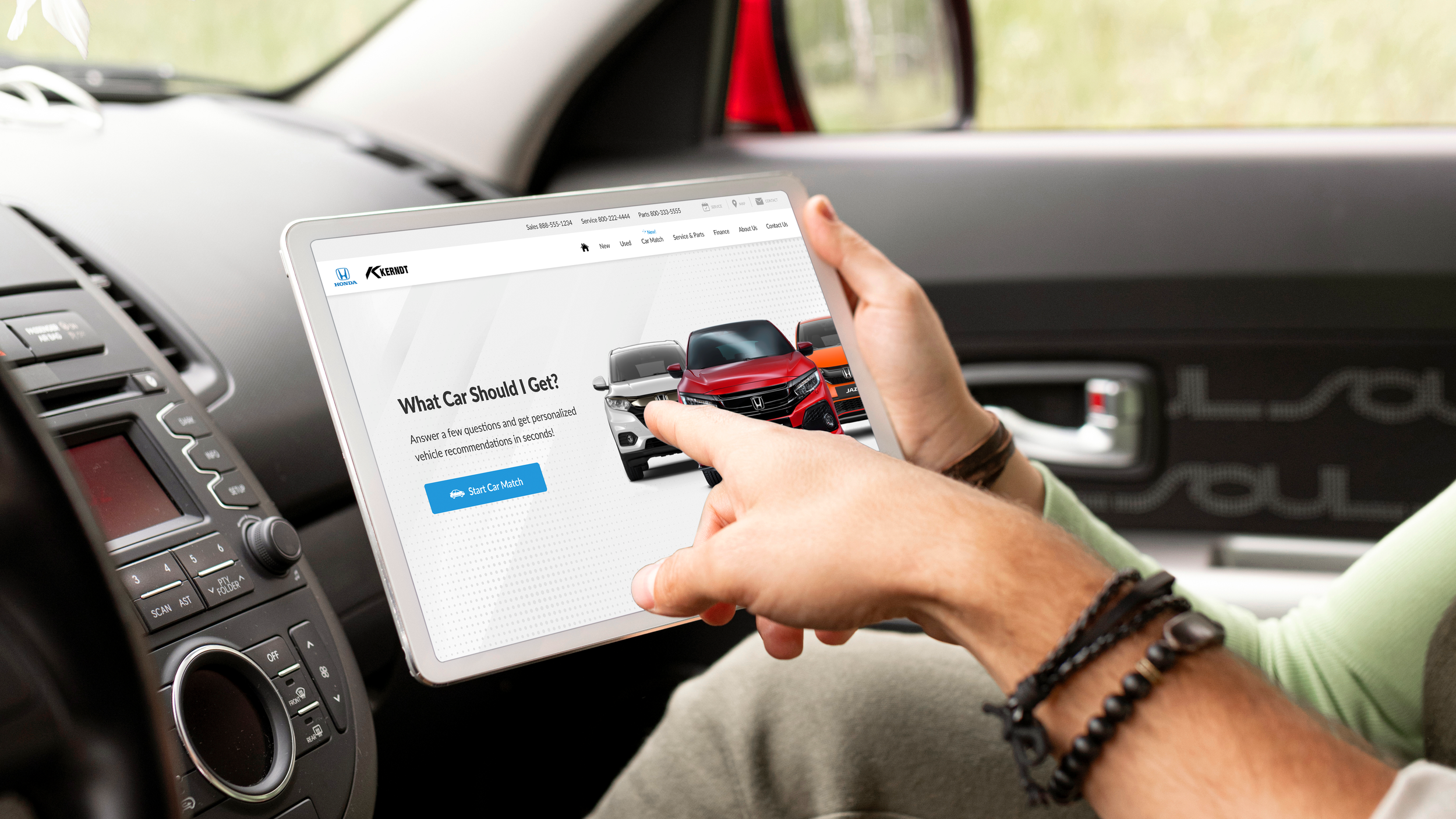
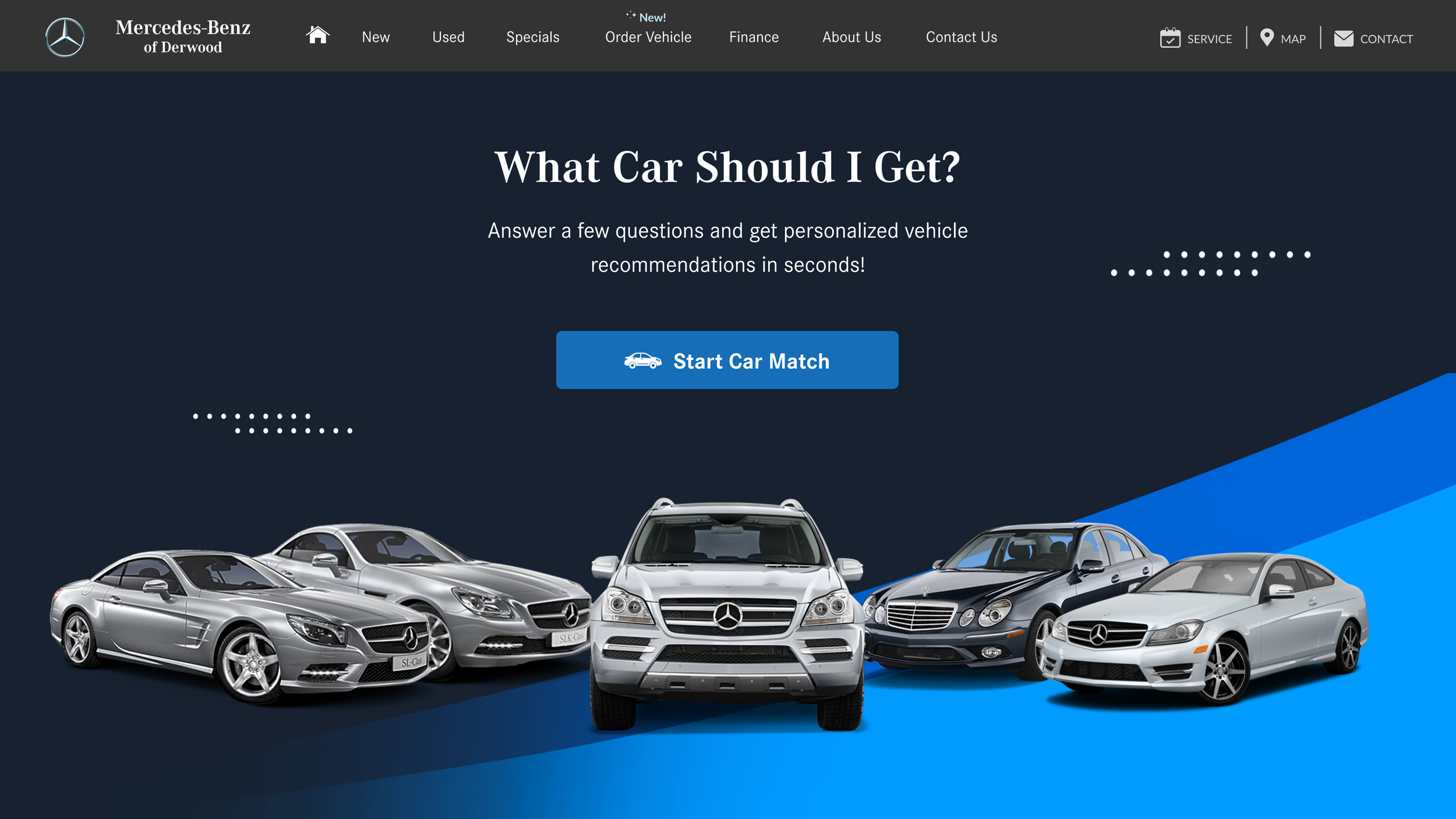
As a Product Designer at DealerOn, I was tasked with creating a personalization tool that matches car shoppers with their ideal car (hello CarMatch.com!)
In the automotive industry, car brands and dealers have always facilitated vehicle knowledge and product availability, but now it’s time to personalize the shopping experience and customer journey.
Project Goals
Ask Questions
Design a set of questions to better understand what shoppers are looking for in their next car.
View Car Recommendations
Design a personalized list of recommendations based on those answers.
Robust Design
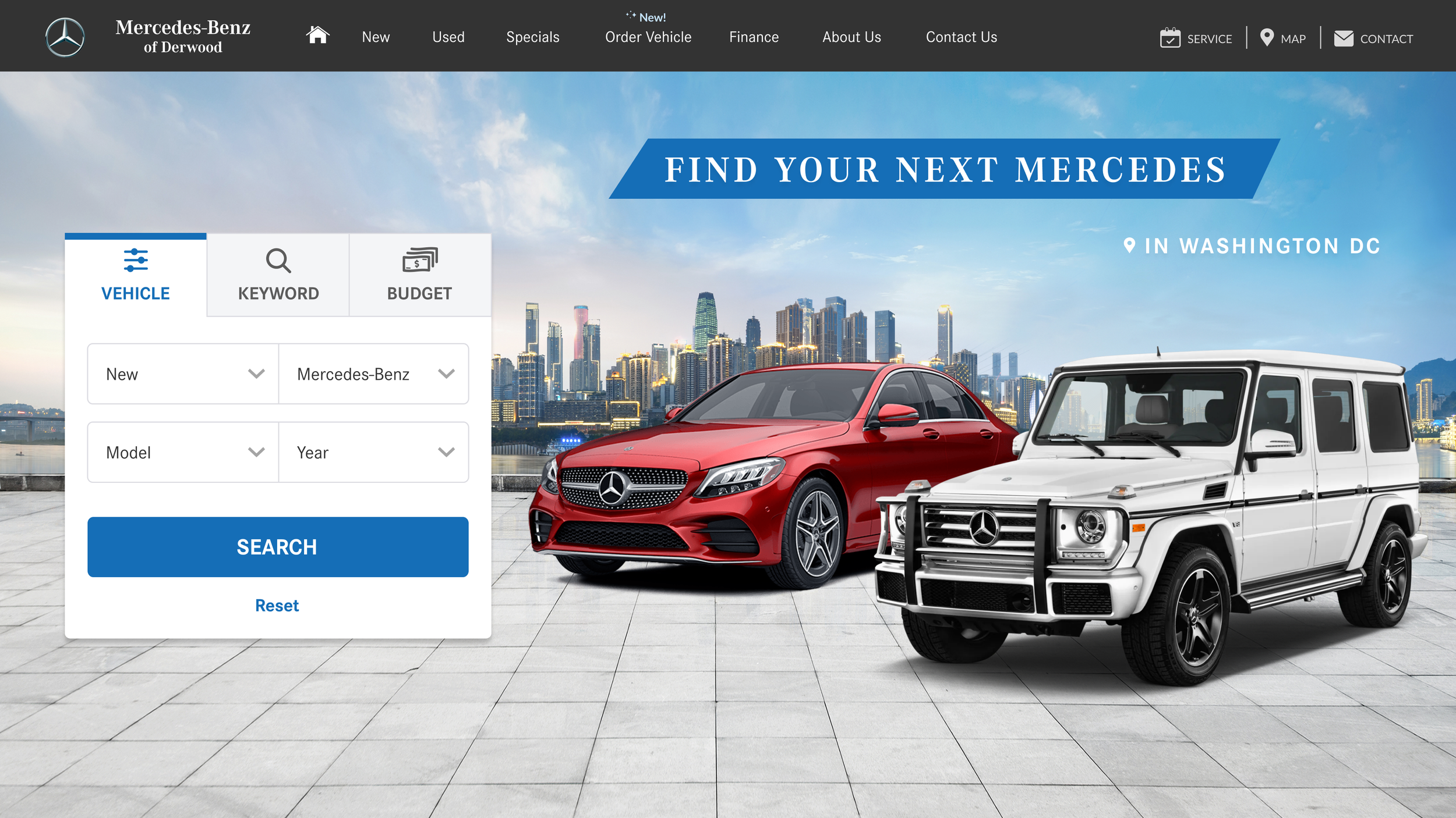
Design a final product that is modular and flexible enough to be deployed on all brands’ websites (Honda, Mercedes-Benz, Ford, etc.)
Competitor Analysis & Market Research
I learned that only a handful of our indirect competitors like Carvana and Shift do so. However, the personalization tools are fraught with unclear navigation and outdated UI design.
Weaknesses:
Vague questions about features
Unsure about availability
Ambiguous % match with no explanation why
Recommendations are not in selected price range
Strengths:
Straightforward, quick, intuitive
Ask about important things to look for in a car
Guided walkthrough with progress indicator
List of top recommendations

User Interview & Empathy Map
Method: 8 user interviews on UserZoomGo. All participants shopped for cars in the last 6 months.
Discovery (Top 3):
Price, MPG (Miles Per Gallon), Style, Features, and Safety are the most important factors people consider when shopping for a new car
Shoppers’ main source of inspiration is Google, followed by family/friends and brand websites
All users want to know if a car is in stock (and if not, how long the wait is)
Pains:
Not knowing if a car is in stock
Not getting the help needed from sales rep
Too much information online
Gains:
Shop for cars anytime online
Find a car based on individual and family needs
See options and compare specs
User Journey Map
Meet Amanda! She’s in the market to buy a new car for work. I walked through the potential touch points of her user journey and looked for opportunities where DealerOn would meet her needs.
What I found interesting was that there are many opportunities to increase customer value through personalization that direct competitors have not addressed even though the need is obviously there. These opportunities would be a solid starting point for me to brainstorm ideas in the next phase.
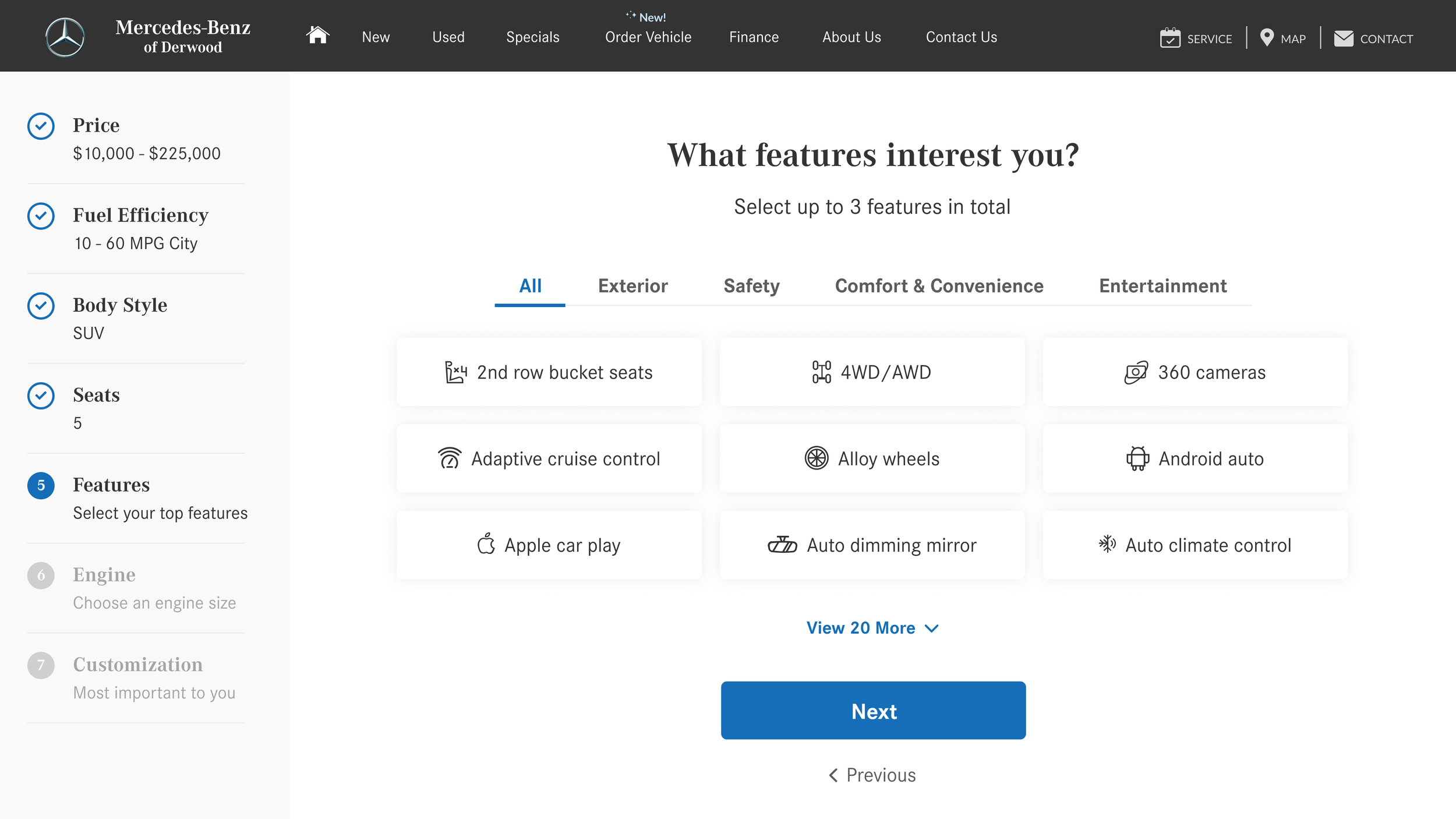
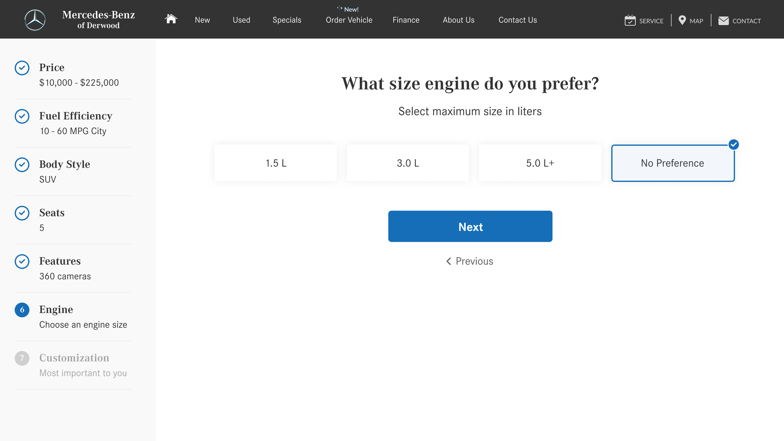
Task Flow
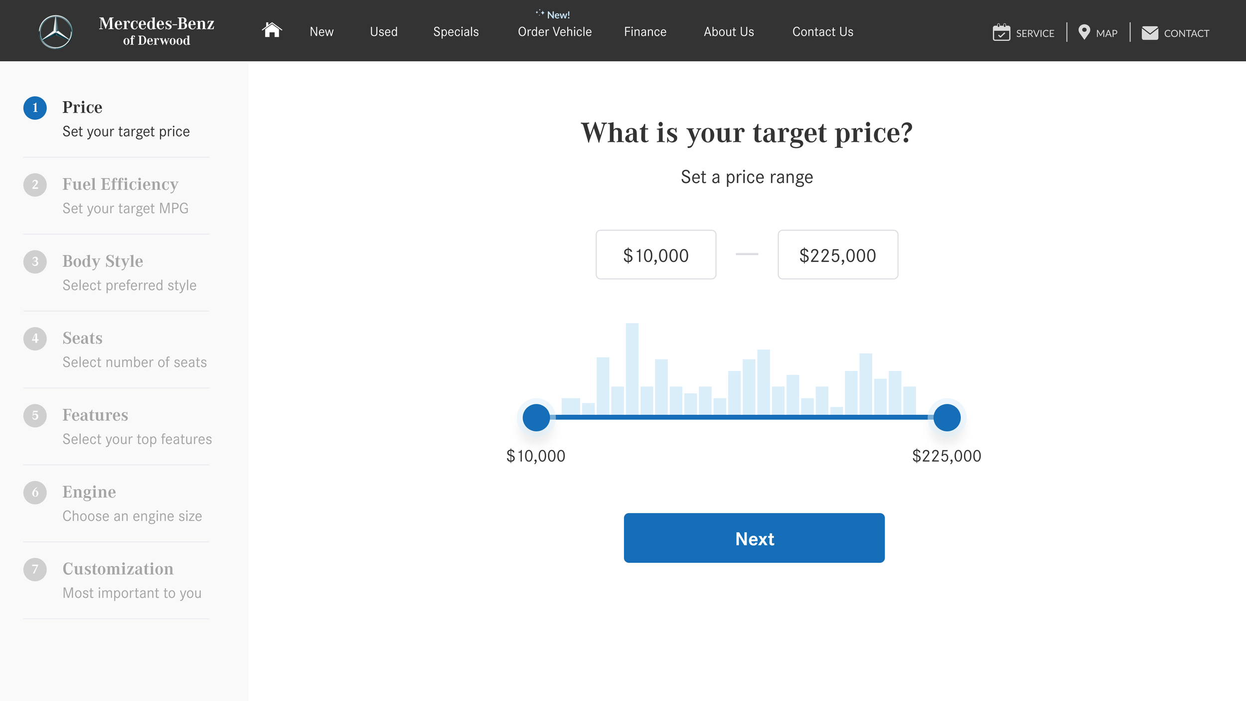
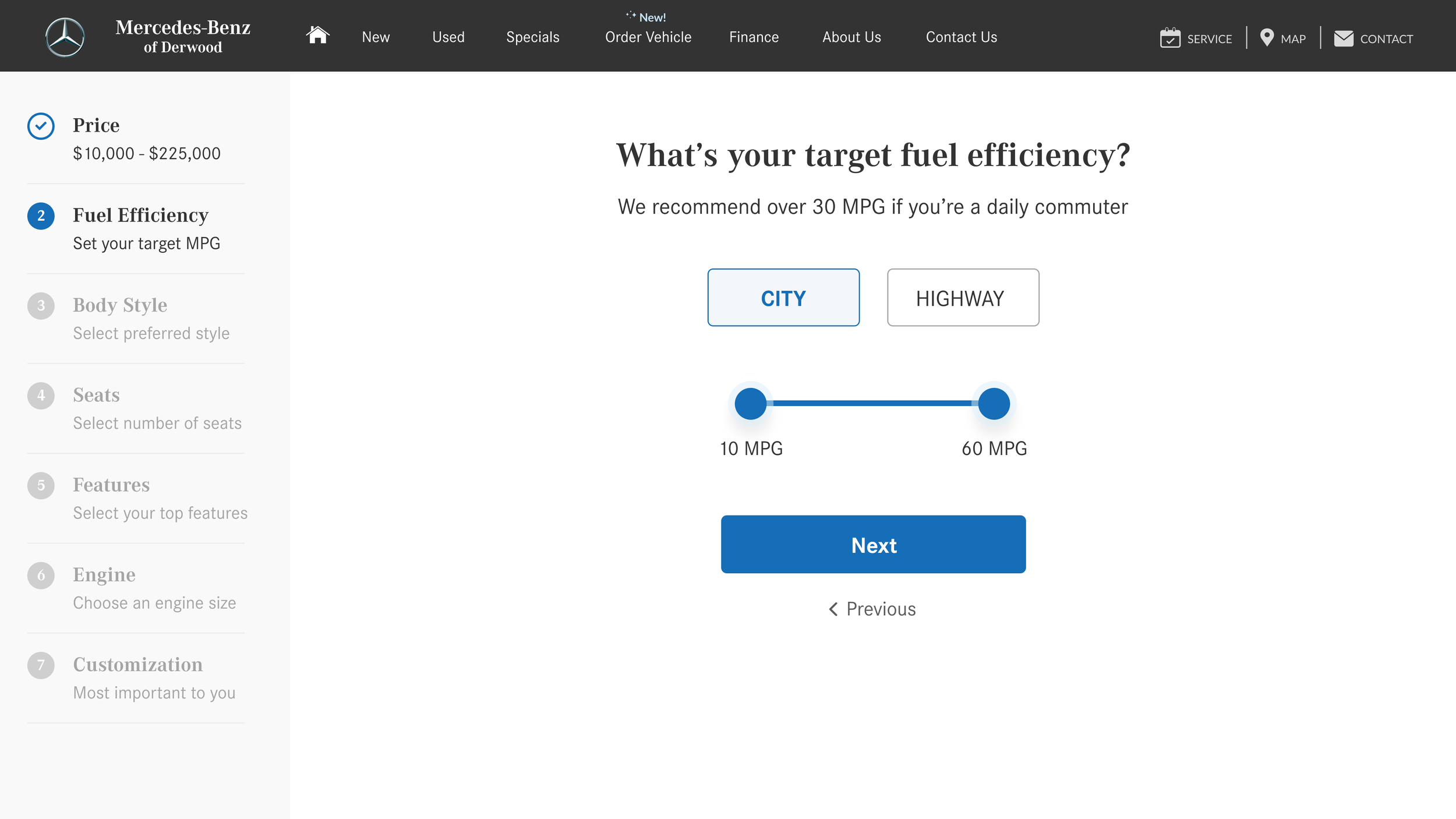
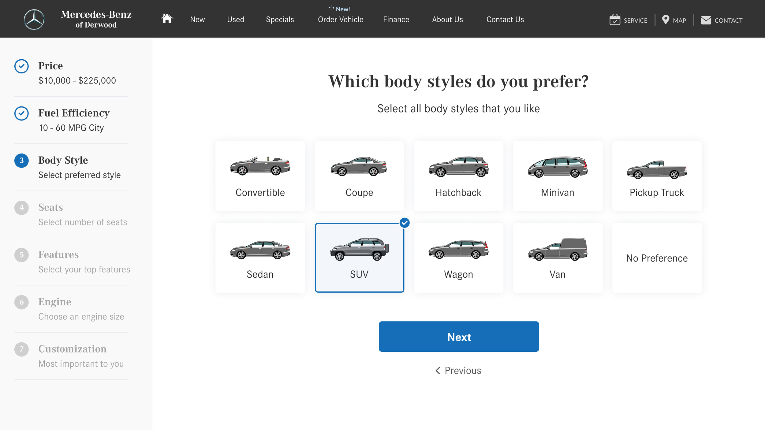
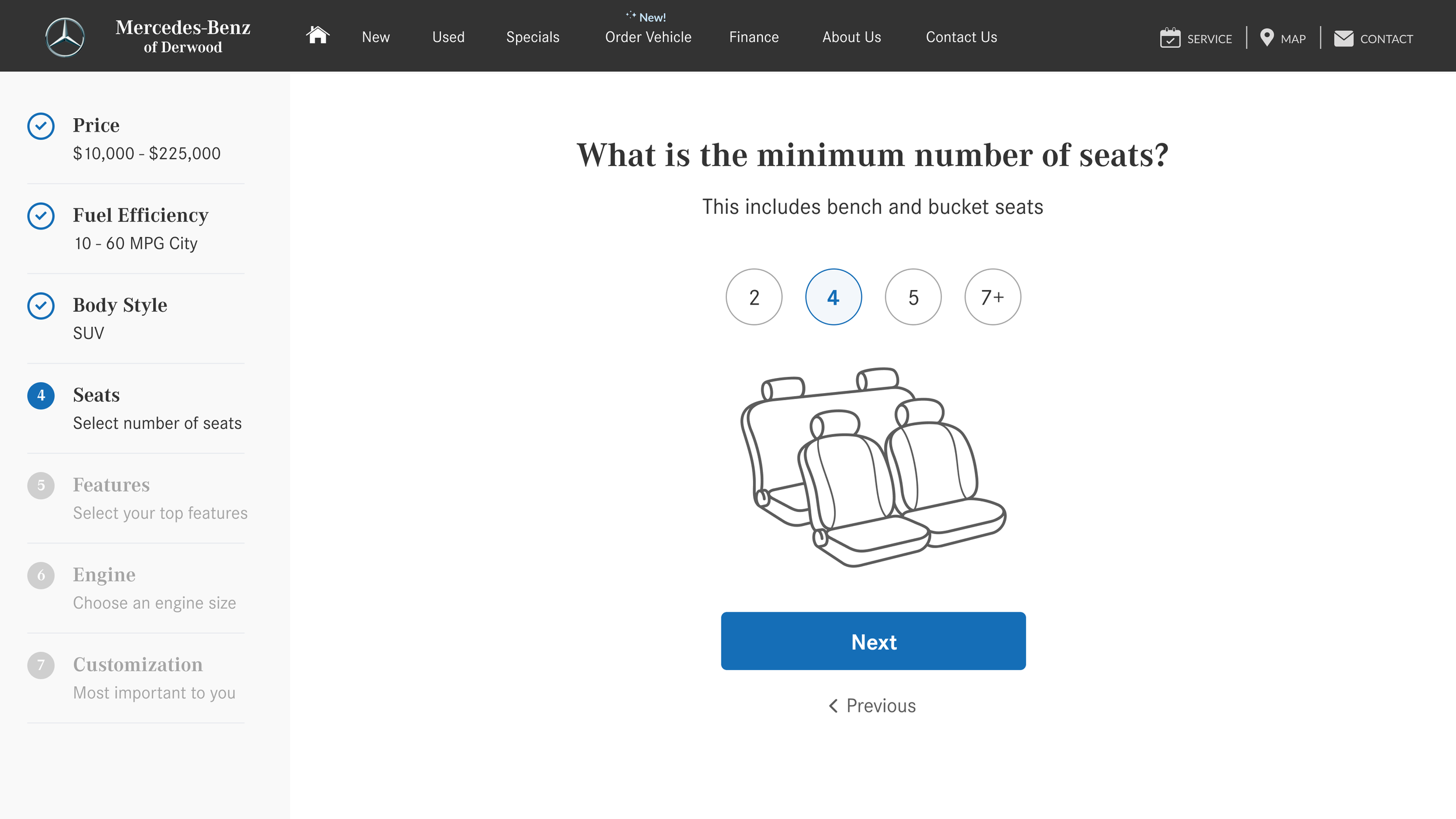
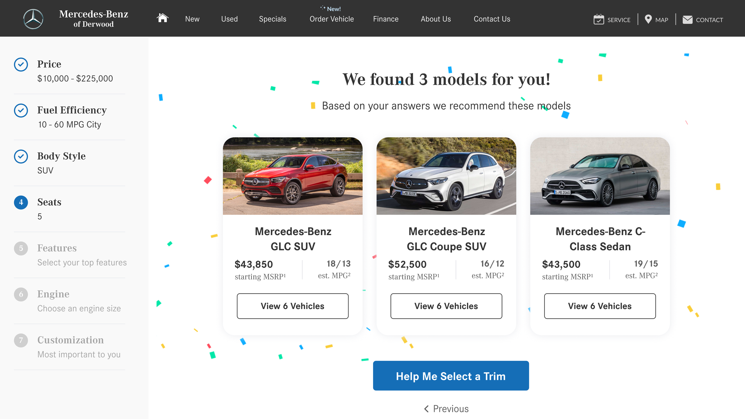
In order to see tailored results, Amanda answers 6 questions that tie to certain attributes. Some attributes like Price and Body Style are at a model level, and others like Features and Engines are at a model and trim level. We opted to simplify the decision making process for Amanda by breaking down complex tasks into smaller steps, and by clearly highlighting the recommended options. We recommended car models based Price, MPG, Body Style, and Seats (all model-related attributes), and provided Amanda with the options to drill into a particular model, or answer trim-related questions to see even more tailored results.
Medium Fidelity Wireframes
Here’s how my medium fidelity wireframes addressed users’ needs and mitigated their frustrations:
The questionnaire is simple, easy, and intuitive to use with no more than one information per page
The car recommendations are tailored to shoppers based on their individual and family needs
Shoppers can easily discern if a vehicle is in stock
Shoppers can see multiple options and compare specs
Besides giving shoppers the ability to modify selection or restart Car Match, we also provide them with direct paths to our other product lines
High Fidelity Wireframes
I learned from my usability testing that my audience wanted all car recommendations to fit within their budget. This is consistent with my user research, since price was the number one priority. Based on what I learned about participants’ pain points and frustrations, I made changes to my prototype to align with users’ mental models and be more effective in meeting their needs.
Questionnaire:
Changed the horizontal progress bar to a vertical style with input. Not only can shoppers see their progression at any time and make modifications, but this design is more responsive and mobile friendly
Added an inventory-driven price range and a stock availability chart
Added an Attributes page to prioritize cars that have features most important to shoppers
Results Page:
Styled “Modify My Selection” and “Restart Car Finder” inside a container so that these actionable items are more obvious to shoppers
Removed title and subtitle to bring more matches into the first fold
Provided shoppers the ability to see all cars in a particular model
Main Screens

Questionnaire:
Walk through a guided process with one question per page
Discern number of steps to completion
Modify previous selections without losing progress

Recommendations:
Tailored to shoppers based on their unique vehicle needs
Discern whether a vehicle is available or when it would be available
See multiple options and compare specs
Modify selection, restart Car Match, or order a vehicle as alternative paths
Responsive Design
More than half (53%) of automotive internet shoppers use their phone in their quest for automotive information. To keep the experience consistent across desktop, tablet, and mobile devices, I opted to stack information rather than resize fonts and components. Following good design principles around giving users feedback, I used a progress bar to manage user expectations, and also made the process for revisions simpler by utilizing the navigation drawer in the hamburger menu.
UI Kit
After filling in my wireframes with color, photos, and branding to visually represent the end product, I created a UI Kit to house all design components of the user interface. I used a combination of elements from my company’s Business-to-Customer (B2C) Cosmos design system, and new ones I created that were≈. For this project’s brand color, I used a shade of blue that is unique to Honda, but I chose secondary colors that would work with other brand colors in mind (think Toyota Red or Chevrolet Gold). In the future as DealerOn adds more products to the Cosmos line, the UI Kit will ensure all design elements share a similar style and work as one mechanism.

Final Takeaways
Customer Journey
By walking through the potential touch points of my persona’s user journey, I discovered many opportunities to increase customer value through personalization that direct competitors have not addressed even though the need was obviously there.
Collaboration is Key
Throughout the PI cycle I checked in with the Inventory team on new features and functionality. When we were able to pull in price range from default inventory, I made sure this was captured in my prototype since that was a notable feedback from my usability testing.
Test Early with Users
I created a prototype with my medium fidelity wireframes to find problems early on in the design process. I learned that it was not obvious for users to change answers and explore trims, so I resolved those issues before adding in UI elements.
Other Case Studies

Toni Patisserie
Responsive Website Redesign and Checkout Feature.

Condé Nast Traveler
Travel Itinerary Feature.

Mirror
Fashion E-commerce Website.