

MIRROR Responsive Website & Logo Design
Year: 2020
Framework: DesignLab’s UX Academy project
Role: Researcher, UX/UI Designer
Duration: 5 weeks
Tools: Sketch, InVision, Marvel, Adobe Photoshop + Illustrator, OptimalSort
Since 1994, Mirror has been a global brick and mortar clothing chain that sells good quality clothes at reasonable prices.
However, with customer trends showing a rapid shift towards online shopping, Mirror wants to stay competitive in the e-commerce market and offer their customers the convenience to shop online. Anywhere. Anytime.
To do so, Mirror seeks to take their business online with a responsive website and modern logo. The shopping experience has to be seamless, with options to shop various styles and filter results at ease.
Project Goals
Responsive Website
Design a responsive e-commerce website that is easy to use, and allows customers to browse and filter by size, color, and style.
Logo
Design a logo that is modern and neutral enough to attract all types of people and styles while retaining brand identity.
The Process
01
Empathize
Conduct research to understand users’ needs, motivations, and frustrations.
02
Define
Synthesize research findings to fully understand users and the problem space.
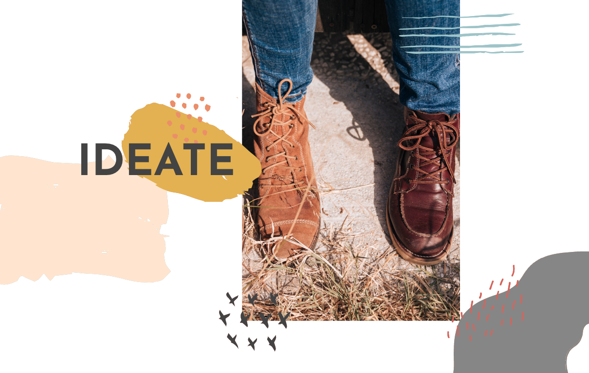
03
Ideate
Brainstorm potential solutions, staying focused on users’ needs and desires.
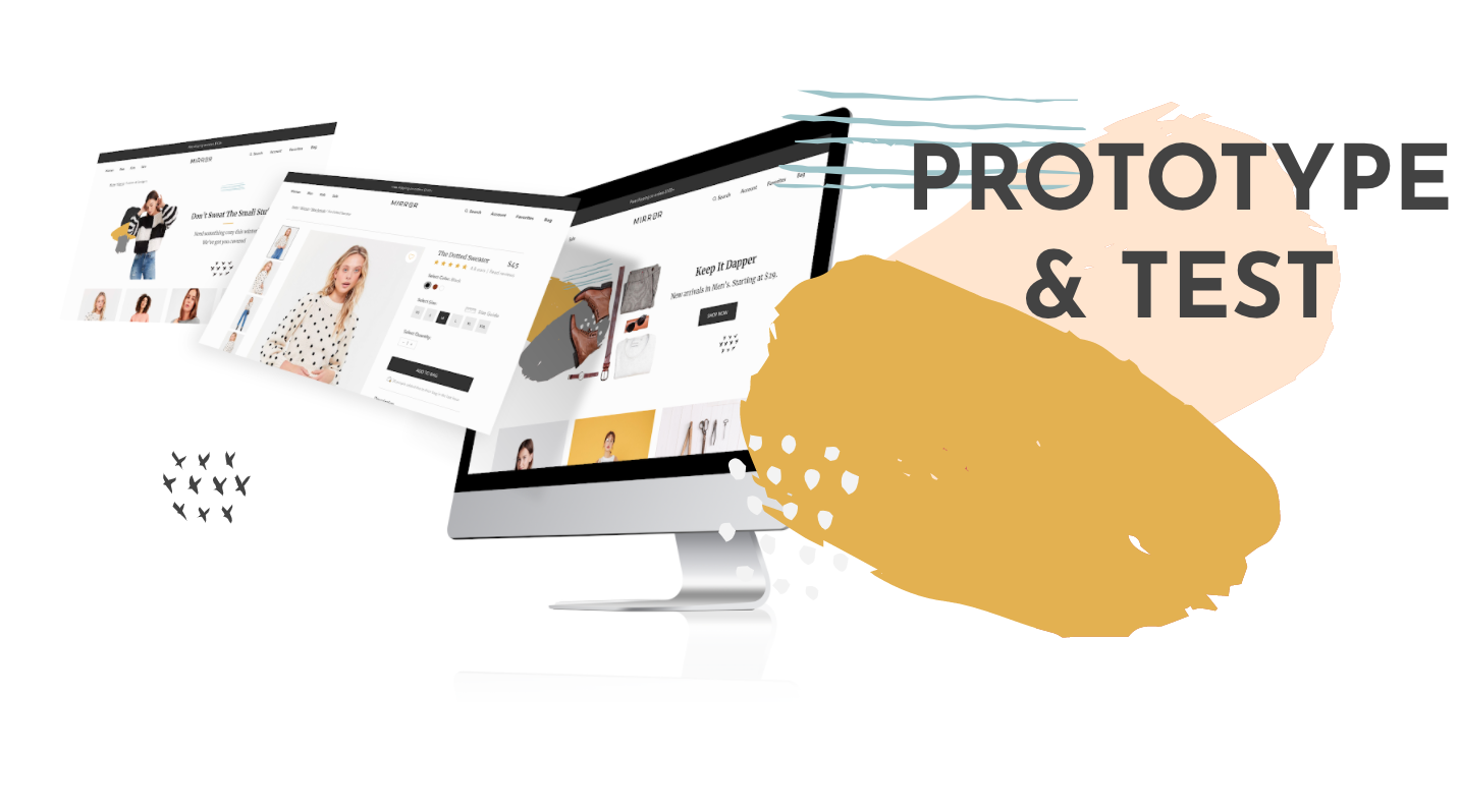
04
Prototype & Test
Build out ideas with a functioning prototype, and conduct tests to refine solution.

Research & Discovery
“Who are the users? What is the current problem space?”
Market Research
I conducted market research to gather data on the current shopping industry, market players, and customer habits. A few notable facts I learned were:
E-commerce accounted for 27% of global fashion sales in 2019, compared to 15% of global retail sales
Global online fashion market was predicted to grow 64% from $533 billion in 2018 to $872 billion in 2023
58% of consumers looked at or tried on apparel in store but later bought it online
Mobile accounted for 65% of traffic to online fashion retailers and 57% of sales, much higher than the overall retail average
AR, VR, wearable tech, and connected fitting rooms are making big waves in the online fashion industry
Competitive Analysis
I looked at the strengths and weaknesses of Mirror’s direct and indirect competitors, and their approach in meeting users’ needs.
I noticed that almost all competitors offer free shipping over certain thresholds, easy exchanges and returns, and affordable pricing. However, in 75% of e-commerce website visits, the customer left without buying anything.
The top reasons why people abandoned purchases online were: bad website functionality (40%), slow delivery (36%), and concerns about quality and fit (35%).
User Interviews
I interviewed potential users to understand their online shopping expectations and experiences.
Duration: 15-20 minutes.
Participants: Shopped online at least once a month, and were familiar with shopping on desktop and mobile devices.
Goal: To understand how participants feel about their online shopping experiences: what are their needs, goals, pain points, frustrations? What current market gaps and opportunities can I identify to create value for users? Asking these qualitative questions would allow me to gain a better understanding of people’s purchase behaviors and how their needs are being served or overlooked by Mirror’s competitors.

Research Synthesis
“What can I learn about users’ behaviors & attitudes?”
Empathy Map
From my interview transcripts, I created an empathy map to organize my research and learn about our participants’ shopping behaviors and attitudes. I learned that:
80% of participants encountered issues navigating the websites, mainly due to lack of search and filtering options
75% of participants abandoned a website because the layout or structure was too confusing
65% of participants chose quality over price
All participants preferred being notified of their purchases via email confirmation
Participants were more likely to purchase online if the website offered free shipping and/or returns
User Persona
Based on my research findings, I learned that shoppers want to find clothes that fit well, purchase them easily online, and choose quality over price. However, many shoppers encounter frustrations that hinder them from making a purchase, mainly due to inaccurate product descriptions, difficulty with navigation, and uncertainty about fit.
Here I created my user persona Sofia who embodies the goals, needs, frustrations, and motivations of these shoppers, bringing them to the forefront of planning before I start designing. Her primary goals were:
To find clothes that fit well
To easily buy clothes online
To shop brands that focus on quality
Project Goals & Features
“What are the user goals, business goals, and technical constraints? What features should I consider within the confines of these goals and limitations?”
Project Goals
Based on what I understood about users, competitors, and the market in the research and discovery section, I created a Venn diagram of standalone and intersecting project goals to help me think strategically about the primary objectives.
I learned that dual purpose goals like clothing variety, positive shopping experience, and secure checkout not only fulfill user goals and business goals, but also synchronized with the major goals and needs of my user persona.
Feature Roadmap
From my user research conclusions and defined goals, I learned that users want an assortment of high quality clothes that fit well, but they can easily abandon a purchase if the website is difficult to navigate, the descriptions are not clear, or they are uncertain about fit.
With these insights in mind, I created a list of key product features to help me plan and prioritize what to build first (they are prioritized based on their importance to Mirror’s business objectives and users’ needs). For instance, a search bar ensures both user and business needs are met when a shopper can quickly find and possibly purchase an item.
Information Architecture
“How do I translate the current mental models of shoppers into the structure of the website?”
Card Sort
From my research findings, where I learned that many shoppers abandon a website if the layout or structure was too confusing, I wanted to understand users’ mental models in recognizing and categorizing information. I ran an open card sort on OptimalSort to help me organize Mirror’s website in a way that felt intuitive to users.
Participants: 8 females and 2 males between the ages of 25-44
Average time taken to complete tasks: 5 minutes 22 seconds
Median categories created: 6
Key findings:
The three main clusters that have the highest group rates were clothing types (tops, bottoms, and outerwear). These aligned with the top categories created
Only 30% of participants created categories based on purpose (work, casual, and lounging)
Male participants created 2-3 more categories than female participants for items that were difficult to categorize (bodysuit, jumpsuit, and maxi dresses)
Sitemap
When I looked at competitors’ websites, I learned that 95% of them categorized their top level pages by Women, Men, and Kids. In my card sort, I discovered that people categorized clothes mainly by type. As I created Mirror’s sitemap, I made sure the structure of the website and the relationship between contents on the proposed pages coincided with shoppers’ mental models and were in sync with my research findings. Additional features such as Favorites and Cart were derived from the Feature Roadmap.
Interaction Design
“What key steps are taken by users to reach their goals?”
Task Flow
With content structure and relationship in place, I created a task flow that focused on the pathway Sofia, my user persona, would take to find and purchase an item on Mirror’s website. What steps would she take to make a purchase, and what features needed to be in place for that to happen? As I connected each page with an action and reflected on users’ need to easily shop online, I learned that it was important to build directional call to action buttons so that users can easily navigate between pages and be aware of what page they are on every step of the way.
User Flow
After identifying what possible steps Sofia would take to purchase an item, I created diagrams that illustrated the different pathways Sofia could take to make that purchase. From the user flow I visually deciphered Sofia’s mental model in completing her tasks, and what pain points and frustrations she could encounter. I learned that there were multiple ways Sofia could start her search — she could expand the top navigation bar, click on the search bar, or browse the home page for certain categories in mind. Also very interestingly I noticed there were many “exit points” where Sofia could quit browsing overall, which is why existing market players provide additional product suggestions. Lastly I learned that Sofia could abandon her cart if she was forced to sign up for an account, so it was important to provide her the guest checkout option as to not disrupt purchase flow.
Wireframe Sketches
With the website’s structure, content relationship, and features in place, I took the “sketch first, digital later” approach to draw out three homepage layouts My wireframes considered the mental models of shoppers on existing e-commerce websites, and focused on visual hierarchy, page structure, and user flow. I learned that with sketching I was able to explore different options quickly so that I could figure out the best design direction. For instance, in my competitor analysis I discovered that people like various ways to shop that were not only limited to gender and product type but also product status — new arrivals, sales, and bestsellers. Therefore I made sure all shopping “entry points” were accounted for in the wireframe sketches.
Responsive Wireframes
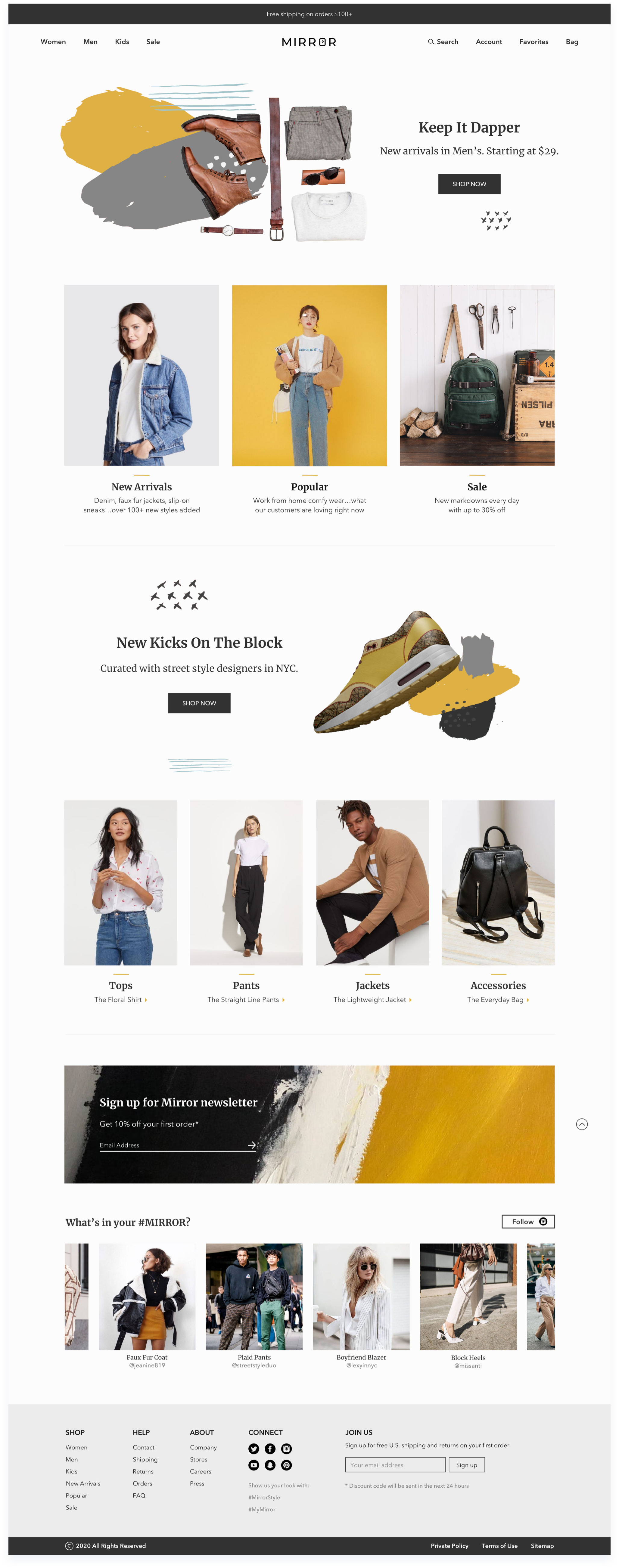
Through wireframe sketches I learned that there were various ways to shop on Mirror. With this in mind, I digitally created a homepage that captured all the shopping variabilities. I ensured gender options were on the global navigation bar with each product category under them, and product status like new arrivals and sales were above the fold. I also changed the term “Cart” to “Bag” after I perused more clothing websites and found that “Bag” was the industry standard. For the rest of the wireframes, I created pages based on the task flow, which was Sofia navigating the website and ultimately making a purchase.
Given people access information from various mediums, the website needed to be consistent on every device. Therefore I built out the static content and visuals on the homepage and category page for desktop, tablet, and phone. These low fidelity wireframes served as blueprints to the visual interface — a guide to hierarchy, priority, and flow before committing to colors and fonts. In the wireframe process I learned to deliver value to users through:
Modern, minimalistic, and clean aesthetics that create a pleasant shopping experience without sensory overload
Various search and filter options for users to easily narrow down their searches and find what they are looking for
A easy and seamless checkout process with visible costs at all times
Logo
My client wanted a modern and neutral logo that would attract all types of people and styles while retaining brand identity. I brainstormed various logo styles that resonated with the brand attributes, and researched industry standards where I learned that most companies use word mark as their logo. For my final design, I went with the word “MIRROR” and customized the “O” — a tribute to reflection marks on a mirror. It was important that Mirror’s logo was not only unique, but also recognizable, memorable, scalable, readable, and clear.
Brand Style Tile
After finalizing the logo design, I brainstormed various brand attributes that resonated with the brand identity, which I later defined as modern, minimalistic, stylish, and versatile. I created Pinterest mood boards to explore the general direction of the brand as well as play with color combination and font pairing. Ultimately I kept the color palette neutral with a pop of yellow for the brand, and incorporated both serif and san serif fonts in my design.
High Fidelity Wireframes
Filling in the details missing in medium fidelity wireframes, I created high fidelity wireframes that visually represented the end product. While building the responsive designs, I learned to downsize by either creating collapsable menus or taking away non-essential features to maintain the minimalistic aesthetics and still allow users to shop seamlessly on the website. Since I used Sketch, I learned to create symbols and text styles without having to change UI elements on each and every art board. With the desktop wireframes complete, I would build out a prototype to validate complex interactions during usability testing.
Branding & UI Kit
To maintain consistency throughout the website and ensure all UI elements are cohesive and aligned with Mirror’s brand, I created a UI Kit to house all design components of the user interface that would be updated as features are adopted or changed. An interesting fact I learned about icons and symbols was to ensure strokes were the same across the board, and that they maintain brand consistency. Because “minimalistic” was one of the brand attributes, I created (and iterated on) icons and symbols that were comprehensible without too many bells and whistles.
The Prototype
With high fidelity wireframes, branding direction, and UI components prepared, it was time to breathe visual life into the design! I used InVision to create a working desktop prototype to test on real users to see whether the navigation was clear and easy to use, and identify features and functionality that may be confusing or misleading. While creating the prototype, I learned to properly link art boards and ensured same features on multiple art boards (eg. progress bar or breadcrumbs) did not move.
Below is a walkthrough video of the prototype.

Usability Testing
In my research, I learned that one of Sofia’s goals was to easily purchase clothes that were the right fit. Therefore I wanted to test how efficient it would be for Sofia to check the size and add an item to her bag via the product page and the results page. Because the checkout process had to be seamless with visible costs at all times, I wanted to see if the purchase flow was intuitive and aligned with users’ mental models.
PARTICIPANTS:
Duration: 20 minutes max
Participants: 8 users, both male and female, between the ages of 24-35
Methodology: in person think-aloud evaluation method, and remote screen share with recording
Previous online shopping experiences required
Comfortable shopping on desktop and mobile devices
GOALS:
Learn about the strengths and weaknesses of the navigation flow and information architecture
If the website is intuitive and align with participants’ mental models
Identify features that are confusing or misleading
Areas of improvement to help me revise and iterate on the prototype
TASKS:
Browse the website to find a dotted sweater. Learn about the sweater, check the size guide, and add it to your bag.
Search for a yellow puffer coat. Add it to your bag from the product results page.
Complete the checkout process on Mirror’s website.
Test Findings
The usability testing gave me valuable insights into participants’ thought process in navigating Mirror’s website. I learned that the top navigation bar was the primary starting point for browsing, and from there 5 out of 8 of participants selected product type. Surprisingly, only 2 participant looked under “New Arrivals”. This supported my research findings that people liked various ways to shop — through search and navigation bars, and by gender, product type, and product status. Below are the patterns, pain points, and frustrations I discovered about Mirror’s usability and interface. Together they spearheaded changes for the next iteration of the prototype.
PATTERNS:
100% of participants were able to complete all the tasks.
85% of participants didn’t use the filter to choose material.
70% of participants started browsing via the top navigation bar versus 20% using the search bar.'
PAIN POINTS & FRUSTRATIONS:
60% of participants found it difficult to find the cotton sweater because they did not see the filter.
40% of participants were disappointed that they couldn’t choose size or color in Quickshop.
RECOMMENDATIONS:
Based on the identified patterns, pain points, and frustrations, I made the following changes to my next iteration (priority based on resources, time, and other deciding factors):
Added material cards that function as filters.
Added the ability to change size and color in Quickshop.
High Fidelity Wireframes
The usability testing gave me helpful feedbacks on the strengths and weaknesses of my prototype. I learned that the Quickshop modal had limitations on product size and color, thereby creating an extra step for users to add an item to bag. I also discovered that when it comes to filtering, even though the drop-down menu was never used, my participants really liked the card format. Lastly, I learned that 7 out of 8 participants used the Guest Checkout option, which confirmed my assumption that a guest checkout option would mitigate disruption of purchase flow. From the affinity map, my findings became insights and recommendations that I used to make changes to my prototype.
Below were the high fidelity wireframes for the Homepage, Product page, Results page with filter, Results page with Quickshop, Checkout page, and Purchase Confirmation page.


Scaling Down
When I first started designing the responsive designs, I broke down the information I needed to display into sections. However, I soon realized that it overly increased the length of the page. By looking at how market players organize their mobile hierarchy strategically, I learned to downsize without compromising valuable information by using collapsable menus and sliders, and to take away non-essential visual elements to maintain the minimalistic aesthetics without disrupting the shopping experience.
Card Sort
I must collect data from a fair number of users before I can achieve a stable picture of different people’s mental models. Nielsen Norman Group recommends 15-20 people. I learned that a good alternative to this sample size is an in-person card sort where I can observe participants as they think out loud, giving me a clearer picture of their reactions and thought processes.
User Persona
I was confident that Sofia represented my main audience segment, but there were too many assumptions about the persona that didn’t take into account context and situations. Going forward, I would couple the user persona with a customer journey map so that I can add in scenarios, expectations, and journey phases to gather holistic insights from my research.
Other Case Studies

Mable
Shop Furniture in Augmented Reality.

Toni Patisserie
Responsive Website Redesign and Checkout Feature.

Condé Nast Traveler
Travel Itinerary Feature.